SaaS UX: What are the Most Inspired SaaS Designs?
cioreviewindia Team | Saturday, 12 December 2020, 10:10 IST

Having a website is essential because it is what your customers use when accessing your products. Therefore, you should have a design that is an added advantage to the user experience. You can obtain fresh ideas for the design by going through the various SaaS company sites.
It might interest you to know that these sites have a uniform design that is done through Webflow. There is no need to write any code. The main objective of each of the SaaS websites is to attract visitors who will then be new customers. On average, a SaaS company makes up to $343,000 each year owing to the increased demand for the service. Here are a few SaaS websites from which you can draw inspiration for your web design exploits.
Proof
A good user experience is primarily based on establishing a personal link with the users. Proof is a perfect illustration of how you can improve your conversion ratio through personalizing user experiences. There is also a provision for social badges that are allocated in real-time. This is essentially what their services are mean to accomplish.
The homepage has demos that show how to use their products. There is another trick up their sleeve: automatic time zones. This feature automatically detects a user's location and adapts to the region's exact time zone. After that, sure can access the numerous CTA variations at their disposal.
HelloSign

The modern layout designs are often being optimized for split screens. This is primarily because the split-screen approach allows for incorporating more details without overcrowding the home screen.
HelloSign uses this approach by splitting the main page while utilizing animated features to pass its central message. They have paid a lot of attention to eliminated formality by making the experience as straightforward as possible for their users.
Lattice
Lattice is a great way to understand how best you can develop a creative narrative by using different user preferences. There is a platform that manages people through documentation of actual insights from employees and managers. The main aim of this strategy is to shed more light on the products and how they differ.
There is also an allowance for receiving feedback and interviews through the platform. You could use this idea and implement it on your site while ensuring that you are secure through the services of a VPN like privateinternetaccess.
Petal

Most banking websites often have the same design that may, at some point, come off as too intimidating. There are usually a lot of sales ads and numerous choices to look over. This is not the case with Petal at all. Petal is a credit card company that is dedicated to user flow and experience. It recently managed to raise about $30 million for its venture funding exploits.
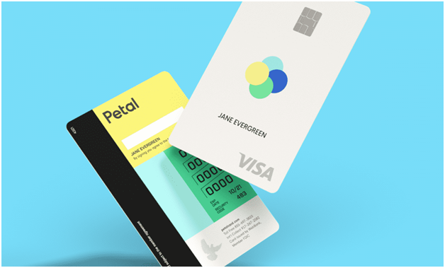
Their main product is the Peta Card that will quickly spark up your attention. Its design is essentially a mixture of exciting colors with enough white accents. It brings out big titles amongst the fluid mix of off-white, teal, and yellow blocks of fantastic color. Using the site makes you feel relaxed with enough cues to ease up your credit card application process.


